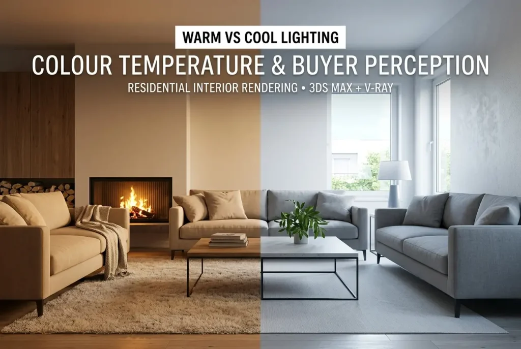
Lighting temperature is one of those things that can make or break a residential interior rendering — and most clients don’t realise it’s even a decision until they see two versions side by side. The topic of Warm vs Cool Lighting in Residential Interior Rendering: How Colour Temperature Changes Buyer Perception might sound like a technical footnote, but in practice it shapes the entire emotional read of a space before a potential buyer has registered a single piece of furniture. In our studio, we’ve had briefs where the floor plan, materials, and furniture were identical across two renders — the only variable was the lighting temperature. The responses from end buyers were noticeably different. That’s not an accident. It’s physics, psychology, and visual communication all working together.
Colour temperature is measured in Kelvin. Lower values — around 2700K to 3000K — produce that golden, amber-tinged light you associate with a lit candle or an incandescent bulb. Higher values — 5000K to 6500K and beyond — push into crisp, blue-white daylight territory. Everything between those poles tells a different story. When you’re rendering a residential interior for a property sales campaign, a developer’s brochure, or a planning submission, the Kelvin value you choose (or that your rendering studio chooses on your behalf) isn’t neutral. It communicates. And it communicates fast — before the viewer consciously processes anything else in the image.
This post breaks down exactly how and why that happens, what we’ve learned from working across different property types and buyer profiles, and how to make deliberate, strategic decisions about lighting temperature instead of leaving it to default settings.
What Colour Temperature Actually Does in a Render
When we talk about warm vs cool lighting, we’re not just talking about aesthetics. We’re talking about how the brain processes a space emotionally. Warm light — that 2700K to 3200K range — triggers associations with rest, comfort, and familiarity. It’s the light of home in the most literal sense: evening lamps, family dinners, a living room winding down for the night. Cool light — 5000K and above — reads as alertness, cleanliness, and precision. It’s the light of a hospital corridor, a design studio, or a bright morning.
In a rendered interior, this plays out across every surface in the scene. A warm light source will tint timber floors towards amber, push cream walls towards gold, and soften shadows into something gradual and gentle. A cool light source will make the same timber appear grey-ish, render white walls as stark white or even slightly blue, and produce harder, more defined shadows. Neither is wrong. Both are tools. The mistake is using them without thinking about what the end buyer is supposed to feel.
There’s also a material interaction to consider. Warm lighting flatters certain material choices — natural wood, stone with warm veining, aged brass fixtures, terracotta tiles — in ways that cool lighting simply doesn’t. Conversely, cool lighting suits polished concrete, matte white surfaces, chrome fittings, and glass. If there’s a mismatch between the material palette and the lighting temperature, the render ends up feeling slightly off — like wearing the wrong colour tie with a suit. It’s hard to explain but easy to feel.
Warm vs Cool Lighting in Residential Interior Rendering: The Buyer Psychology Behind the Choice
Developers selling off-plan residential properties need buyers to do something emotionally complex: imagine living in a space that doesn’t exist yet. How residential developers use interior renderings to sell off-plan properties before construction starts is a question we answer daily, and lighting temperature sits right at the heart of it.
Warm lighting tells a story of inhabitation. It implies that someone lives here — or could. There’s an implied time of day (evening, golden hour, after-work), which maps to relaxation and ownership rather than transactional space-viewing. For a family home, a premium apartment, or a retirement living scheme, this emotional positioning is almost always the right call. Buyers aren’t just evaluating square footage; they’re projecting a version of their life onto the image.
Cool lighting, on the other hand, signals modernity, efficiency, and clarity. It works well when the target buyer values precision over warmth — think a minimalist city apartment pitched at young professionals, a co-living unit where functionality is the selling point, or a home office configuration where the lighting reinforces productivity. It can also work for premium properties where the architectural language is deliberately austere and sculptural.
The mistake we see most often? Developers defaulting to cool, bright lighting because it “shows the space off better.” Yes, cool light reads as spacious. But spacious and liveable aren’t the same signal. A render that looks like a furniture showroom isn’t moving anyone emotionally. And emotional response is what drives off-plan purchase decisions.
How to Match Lighting Temperature to Room Type
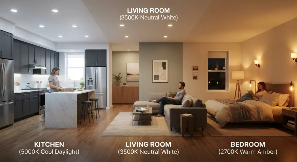
Different rooms carry different functions and different emotional expectations. A single Kelvin setting across an entire property suite of renders is rarely the right approach. Here’s how we think about it room by room:
| Room Type | Recommended Temperature Range | Emotional Goal |
|---|---|---|
| Living Room | 2700K – 3000K (warm) | Comfort, relaxation, family life |
| Master Bedroom | 2700K – 3200K (warm) | Intimacy, calm, sanctuary feel |
| Kitchen | 3500K – 4000K (neutral to cool-white) | Cleanliness, precision, activity |
| Bathroom | 3000K – 4000K (neutral) | Freshness, cleanliness, spa-like calm |
| Home Office / Study | 4000K – 5000K (cool-white) | Focus, clarity, productivity |
| Open-Plan Dining/Living | Mixed: 2700K ambient + 4000K task | Balance between function and warmth |
The kitchen deserves a specific note. We often see briefs where the developer wants a “warm kitchen” — and that’s fine as an intention — but if the kitchen is predominantly white cabinetry with engineered stone countertops, a very warm light will make everything look slightly yellow. That reads as grubby rather than cosy. Nudging to 3500K with some warm accent lighting over the island is usually the sweet spot. It photographs (or renders) as clean while still feeling approachable.
Natural Light vs Artificial Light in Interior Renders — and Why Both Matter
In most residential interior renders, we’re working with a combination of natural daylight coming through windows and artificial light sources placed within the scene. These two light types have their own colour temperatures and they interact with each other — sometimes elegantly, sometimes not.
Natural daylight at midday reads around 5500K to 6500K. Golden hour — the hour after sunrise or before sunset — drops to around 3000K. If you’re rendering a living room flooded with golden afternoon light through full-height windows, layering warm artificial lighting on top creates a rich, inviting scene. If you’re rendering the same room with neutral midday light and cool artificial pendants, you get something that reads as contemporary but emotionally distant.
This is where daylight simulation genuinely matters. For developers working on projects where sun orientation affects value, accurate daylight rendering isn’t just aesthetic — it’s commercial. We’ve written before about daylight simulation in architectural rendering how accurate sun studies are helping developers beat planning objections, and the same principles apply when you’re crafting an interior scene. The angle, intensity, and colour temperature of natural light should be physically plausible for the building’s orientation — not just aesthetically pleasing in isolation.
We also control the time of day deliberately. An east-facing bedroom rendered at 7am with warm morning light reads completely differently to the same bedroom at 2pm with overhead daylight. The first feels like a place you’d want to wake up in. The second feels like a room photographed for an estate agent listing. Neither is wrong — but one is more likely to make a buyer feel something.
What Clients Get Wrong — and What We Fix Before Signing Off
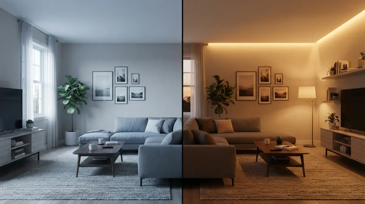
The most common mistake we field from clients — particularly developers who’ve had renders done elsewhere — is what we call the “bright white everything” brief. The assumption is that bright renders look expensive. That’s partly true. Dark, flat renders do look cheap. But there’s a significant difference between well-lit and over-lit. Cranking the exposure and pushing colour temperature to 6000K doesn’t make a render look luxurious. It makes it look like a tech office.
The second mistake is inconsistency across a render suite. If you’re delivering a set of eight interior renders for a property sales campaign — and if you’re wondering how many you actually need, how many renders do you actually need for a property development sales campaign a project-type breakdown is worth reading — the lighting should tell a coherent visual story across the whole set. If the living room is warm and golden, the bedroom is cool and clinical, and the kitchen is somewhere in between, buyers experience visual whiplash. The property feels incoherent.
Third: ignoring the target buyer entirely. A later living scheme should almost certainly be rendered with warmer, gentler lighting — the demographic is looking for homeliness and reassurance, not minimalist sharpness. A premium urban apartment targeting young professionals in their 30s can afford to push into cooler, moodier territory, provided the materials support it. The lighting temperature should be briefed the same way you’d brief the furniture style or the colour palette — with the buyer’s emotional response as the target, not the artist’s personal preference.
Interior designers tend to understand this instinctively, which is why how interior designers use 3d renderings to win residential refurbishment projects before a single sample board is made is increasingly relevant — they’re not just using renders to show spaces, they’re using them to pre-validate a mood before anything is specified or purchased.
Practical Lighting Temperature Decisions: A Quick Reference for Briefing
When you’re briefing a rendering studio on a residential interior project, here’s how to communicate lighting temperature intent clearly without needing to know the technical settings:
- “Evening, lamp-lit living room” — This tells us warm ambient, around 2700K, with visible light pools from pendants and table lamps. Golden shadows, soft contrast.
- “Bright morning kitchen” — Natural light-led, 4500K to 5500K, clean shadows, minimal warm accent. Feels functional and fresh.
- “Boutique hotel bathroom” — Neutral to warm, 3000K, with mirror lighting slightly cooler to simulate vanity lighting. The goal is spa-like calm, not clinical brightness.
- “Cosy bedroom, late afternoon” — Warm, directional light raking through sheer curtains, maybe 3200K. Soft, intimate, low contrast.
- “Minimal loft apartment, daytime” — High-key natural light, 5000K, very clean whites, designed shadows. Contemporary and precise.
You don’t need to specify Kelvin values in your brief. Describe the scene emotionally and temporally — time of day, mood, who’s in the room — and a competent studio will translate that into the right technical choices. If they don’t ask those questions before starting, that’s worth noting.
Conclusion: Lighting Temperature Is a Sales Tool, Not a Technical Detail
The difference between a render that generates enquiries and one that gets scrolled past is rarely about polygon count or render resolution. It’s about whether the image makes someone feel something. Lighting temperature is one of the fastest, most direct ways to shape that feeling — and it costs nothing extra to get right if the brief is clear from the start.
Warm vs cool lighting in residential interior rendering and how colour temperature changes buyer perception is ultimately a conversation about intent. What do you want the person looking at this image to feel? Warm and at home? Sharp and impressed? Calm and luxurious? Every answer maps to a different light. Get that decision right at the briefing stage and everything downstream — material choices, camera angles, time of day — aligns more naturally.
If you’re working on a residential development project and want renders that are built around buyer psychology rather than default studio settings, our residential interior rendering service is where we put this thinking into practice. We’d be glad to talk through the lighting brief alongside the visual brief — they’re the same conversation. Contact us to get started.
Frequently Asked Questions
What colour temperature should I use for residential interior renderings to make spaces look more inviting to buyers?
For most residential interiors, warm lighting between 2700K and 3000K creates a cozy, welcoming atmosphere that triggers emotional responses associated with comfort and home, making buyers more likely to form a positive connection with the space. Living rooms, bedrooms, and dining areas particularly benefit from this warmer range, as it flatters wood tones, warm paint colours, and soft furnishings. Studies in real estate marketing consistently show that warm-lit renderings generate higher engagement and emotional appeal compared to cooler alternatives in residential contexts.
How does cool lighting in interior renderings affect buyer perception of smaller rooms or bathrooms?
Cool white lighting between 4000K and 5000K can make smaller spaces like bathrooms, laundry rooms, and home offices appear cleaner, larger, and more functional, which appeals to buyers evaluating practicality and hygiene. This colour temperature reflects off white tiles and surfaces more crisply, enhancing the sense of brightness and square footage in tight spaces. However, overusing cool tones throughout an entire residence can make the home feel clinical or cold, reducing the emotional warmth buyers subconsciously seek in a family living environment.
Can mixing warm and cool lighting in a single interior rendering improve buyer appeal?
Yes, strategically layering warm ambient lighting with cooler task or accent lighting in a single rendering mimics how professional interior designers actually light real homes, which increases perceived authenticity and sophistication. For example, showing warm overhead pendants paired with cooler under-cabinet kitchen lighting signals both comfort and functionality to prospective buyers simultaneously. This balanced approach also demonstrates spatial hierarchy, guiding the viewer's eye through the room while reinforcing that each area serves a distinct and thoughtful purpose.
What is the psychological impact of warm versus cool lighting on buyer decision-making in property marketing?
Warm lighting activates psychological associations with safety, relaxation, and belonging, which can accelerate emotional decision-making and reduce a buyer's hesitation during the evaluation process. Cool lighting, by contrast, stimulates perceptions of cleanliness, professionalism, and efficiency, which may appeal more strongly to buyers prioritising practicality or purchasing commercial-adjacent residential spaces. Understanding this distinction allows rendering artists and property marketers to tailor the lighting narrative to the specific buyer persona they are targeting, directly influencing conversion rates.
Does colour temperature in interior renderings affect how paint colours and materials are perceived by potential buyers?
Absolutely, colour temperature dramatically shifts how paint colours, fabrics, and surface materials read in a rendering, with warm lighting enriching earthy tones, creams, and timber finishes while potentially making cool greys appear muddy or yellowish. Conversely, cool lighting enhances the clarity of white cabinetry, marble surfaces, and blue or green colour palettes but can make warm wood tones look dull and uninviting. Rendering artists must account for the specific material palette of each interior before selecting a lighting temperature to ensure the finishes are represented accurately and attractively to prospective buyers.
Also read: Furnished vs Unfurnished 3D Interior Renders: Which Version Sells Off-Plan Apartments Faster and Why