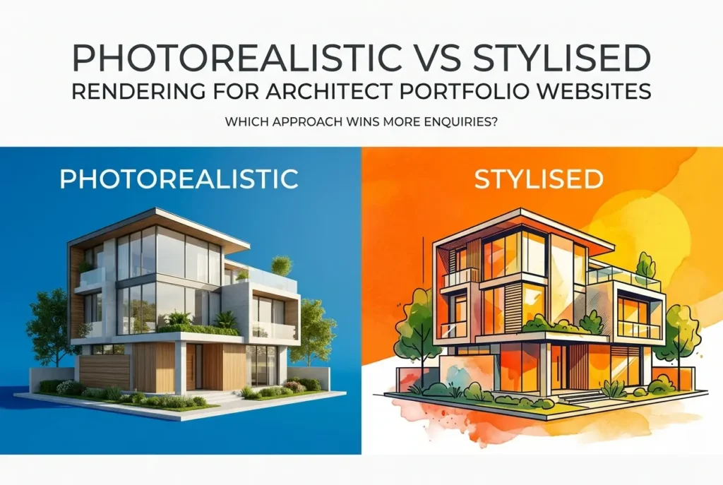
An architect once told us he’d spent three years perfecting his portfolio’s “moody, painterly” render style — beautiful, atmospheric, almost gallery-worthy — only to watch enquiries trickle in slower than the plain photographic renders his competitor down the road was using. That conversation stuck with us because it’s the exact question we get asked in some form every month: should a portfolio site lean photorealistic or stylised? The honest answer is that Photorealistic vs Stylised Rendering for Architect Portfolio Websites: Which Approach Wins More Enquiries isn’t a matter of taste — it’s a matter of who’s looking at the site and what they need to believe before they pick up the phone.
We’ve rendered for architects pitching six-figure private residences and for practices chasing local council extension work, and the pattern is consistent enough to talk about with confidence. Photorealism tends to win trust faster. Stylised work tends to win attention faster. The trick is knowing which one your actual enquiry funnel needs, because a portfolio built for the wrong audience quietly loses business without ever telling you why.
In this piece, we’ll break down what each style actually communicates, where each performs best, and the mistakes we see architects make when they choose a rendering direction based on personal aesthetic preference rather than commercial outcome.
What “Photorealistic” and “Stylised” Actually Mean in Practice
Before comparing performance, it’s worth being precise about definitions, because a lot of confusion in this debate comes from architects using the terms loosely.
Photorealistic rendering aims to be indistinguishable from a photograph — accurate material response, physically correct lighting, real-world imperfections like dust on glass or slight lens distortion. It’s the same discipline covered in our piece on what makes a commercial exterior rendering look photorealistic lighting materials and context explained — it’s not about making things look “nice,” it’s about making them look true.
Stylised rendering deliberately steps away from photographic accuracy. This includes watercolour-effect exteriors, flat-shaded isometric interiors, sketch-over renders, or heavily graded cinematic looks with exaggerated colour and contrast. It borrows more from illustration and concept art than from photography.
Neither is “better” in the abstract. They solve different problems for different viewers.
Photorealistic vs Stylised Rendering for Architect Portfolio Websites: Which Approach Wins More Enquiries — The Trust Factor
Here’s the core mechanic we’ve observed across dozens of portfolio projects: enquiries increase when a visitor can imagine themselves in the space, and decrease when they have to work to interpret what they’re looking at.
Photorealistic renders remove interpretation. A homeowner browsing your site doesn’t need architectural literacy to understand a photoreal kitchen render — it reads exactly like a photograph of a finished home, which is precisely the outcome they’re paying for. This is why residential-focused practices — extensions, self-builds, high-end refurbishments — consistently see photorealism outperform stylised work. The client isn’t buying a design philosophy, they’re buying confidence that the finished space will look like what they were shown.
Stylised rendering asks more of the viewer. It communicates “vision” and “concept,” which resonates strongly with sophisticated clients — developers, other architects, competition juries — but can create hesitation in a residential homeowner who wants literal reassurance before committing tens of thousands to a build.
| Audience Type | Tends to Respond Better To | Why |
|---|---|---|
| Private homeowners / self-build clients | Photorealistic | Need literal reassurance before financial commitment |
| Developers & investors | Photorealistic, with context | Assessing marketability and buyer appeal, not concept |
| Design award juries / architecture press | Stylised or hybrid | Rewards conceptual clarity and visual distinctiveness |
| Planning committees & councils | Photorealistic, contextual | Need to judge real-world visual impact accurately |
| Interior design referral clients | Photorealistic with warmth | Emotional buy-in to lifestyle, not abstraction |
Where Stylised Rendering Actually Earns Its Place

We don’t want to overstate the case for photorealism, because stylised work has genuine strengths that photoreal renders can’t replicate.
Concept-stage stylised renders signal that a design is still fluid — which matters enormously when a practice is pitching a masterplan or early feasibility scheme where nothing is fixed yet. A hyper-realistic render of a scheme that’s still 30% resolved can actually backfire, because it implies more certainty than the design has earned. This is a similar principle to the one we discuss when comparing residential exterior rendering styles compared photorealistic vs sketch vs watercolour which wins planning committees — sketch and watercolour styles often win early-stage planning conversations precisely because they read as proposals rather than promises.
Stylised work also differentiates a portfolio in a market saturated with photoreal CGI. If every competing practice’s website looks like a real estate brochure, a distinctive illustrative style can make a small studio look more memorable and more design-led. We’ve seen boutique residential architects use painterly renders specifically to attract clients who want a design partner with a strong personal aesthetic, not a volume housebuilder look.
The Middle Ground Most Successful Portfolios Actually Use
In our experience, the highest-converting architect portfolios rarely pick one lane exclusively. They segment by project stage and project type.
Completed or near-final projects get photorealistic treatment — full material accuracy, correct daylight simulation, furnished interiors that look lived-in. This is the section doing the heavy lifting for enquiry conversion, because it’s the proof-of-work a hesitant client needs to see before contacting the practice.
Early-concept or competition work gets a lighter, more stylised treatment — massing studies, sketch-over renders, monochrome exteriors. This section signals design thinking without over-promising a fixed outcome, and it tends to attract more design-literate enquiries: developers, other architects, or clients specifically looking for conceptual strength.
A practice that mixes both intelligently — clearly labelled by project stage — actually builds more trust than one that’s uniformly photoreal or uniformly stylised, because it demonstrates range without confusing the viewer about what stage each project is actually at.
What Architects Get Wrong When Choosing a Rendering Style

The most common mistake isn’t choosing the “wrong” style — it’s choosing a style based on what the architect finds visually satisfying rather than what the enquiry-generating audience needs. A watercolour render might feel more “architectural” to the person who designed the building, but if the site’s actual visitors are homeowners deciding whether to spend their renovation budget with you, that same render can quietly increase bounce rate.
The second mistake is inconsistency in lighting and material quality within the photoreal category itself. A portfolio with three beautifully lit renders and two flat, underlit ones doesn’t read as “artistic variation” — it reads as inconsistent quality, and viewers assume the weakest render represents your baseline. This is closely tied to lighting fundamentals we cover in warm vs cool lighting in residential interior rendering how colour temperature changes buyer perception — colour temperature alone can shift how welcoming or clinical a space feels to a prospective client.
The third mistake is treating portfolio renders and planning-submission renders as interchangeable. A render built to win over a homeowner emotionally is not the same render a council officer needs to assess massing and street impact, which is a distinction we go into more in exterior 3d rendering for planning permission what councils actually look for in visualisations. Portfolios optimised purely for planning accuracy often feel cold and uninviting to a residential audience.
Finally, a lot of practices under-invest in context — street furniture, landscaping, realistic human figures, believable sky and lighting conditions. Whether photoreal or stylised, a render sitting in a visual void feels unfinished. We’ve written before about why context matters in architectural rendering how streetlevel surroundings and people make or break a development visual, and portfolio renders are no exception — a beautifully modelled house floating on an empty green plane doesn’t build the emotional connection a well-composed scene does.
Practical Recommendations for Portfolio Rendering Strategy
If your enquiries come mostly from private clients — homeowners, small residential developers, self-builders — weight your portfolio toward photorealistic residential exterior rendering and residential interior rendering, and reserve stylised work for a clearly separated “concept” or “process” section.
If your enquiries come mostly from developers, institutional clients, or design competitions, you have more room to lead with stylised or hybrid work, but make sure any project heading toward planning or investment sign-off is backed by fully resolved commercial exterior rendering further down the page — decision-makers eventually need the literal version regardless of how the concept was first pitched.
Whatever mix you choose, keep quality consistent within each category. One weak render undermines an otherwise strong portfolio far more than most architects expect.
Getting the Balance Right
There’s no universal winner in this debate, and any studio claiming there is one is oversimplifying a decision that actually depends on your client base, project types, and where in the design process each render sits. What we can say with confidence, after producing both styles for architecture practices across very different markets, is that the portfolios generating the most enquiries are the ones that match rendering style to audience intent rather than personal preference.
If you’re not sure which direction fits your practice, or you want a portfolio audit before committing to a rendering direction, get in touch with our team through contact us and we’ll walk you through what’s actually working for practices in your specific niche.
Frequently Asked Questions
Does photorealistic rendering actually generate more client enquiries than stylised rendering for architecture portfolios?
Photorealistic rendering typically converts better for residential and commercial clients who need to visualise the finished space before committing budget, as it reduces perceived risk and builds trust quickly. However, stylised rendering can outperform it for design-led studios targeting creative or hospitality clients who value conceptual thinking over literal representation. The right choice depends on matching the rendering style to your target client's decision-making priorities.
What type of architecture clients respond better to stylised or artistic renders?
Boutique developers, hospitality brands, and clients seeking bold conceptual design tend to respond better to stylised renders because they signal creativity and a distinct design point of view. These clients often hire firms specifically for their aesthetic voice, so overly literal imagery can undersell the studio's design sensibility. Stylised visuals also help these portfolios stand out in crowded, image-saturated markets.
How do photorealistic renders affect website loading speed and conversion rates?
High-resolution photorealistic renders are significantly larger in file size, which can slow page load times and hurt conversions if not properly optimised with compression, lazy loading, and modern formats like WebP or AVIF. A one-second delay in load time can reduce conversions by measurable percentages, so architects must balance visual fidelity with technical performance. Stylised or illustrated renders often load faster naturally, giving them a UX advantage on mobile devices.
Can architects mix both photorealistic and stylised rendering styles on the same portfolio site?
Yes, many successful architecture portfolios use photorealistic renders for finished project showcases and stylised sketches or diagrams to communicate concept development and design process. This hybrid approach demonstrates both technical execution and creative thinking, appealing to a broader range of client preferences. The key is maintaining visual consistency within each project gallery so the mix feels intentional rather than disjointed.
Which rendering style is better for architect portfolios targeting high-end residential clients?
High-end residential clients generally favour photorealistic rendering because it helps them emotionally connect with materials, lighting, and spatial atmosphere before making a significant investment decision. These clients are often less familiar with reading architectural drawings or abstract visuals, so realism reduces uncertainty and accelerates trust-building. That said, pairing photorealistic hero shots with stylised process diagrams can reinforce design credibility without sacrificing conversion potential.