
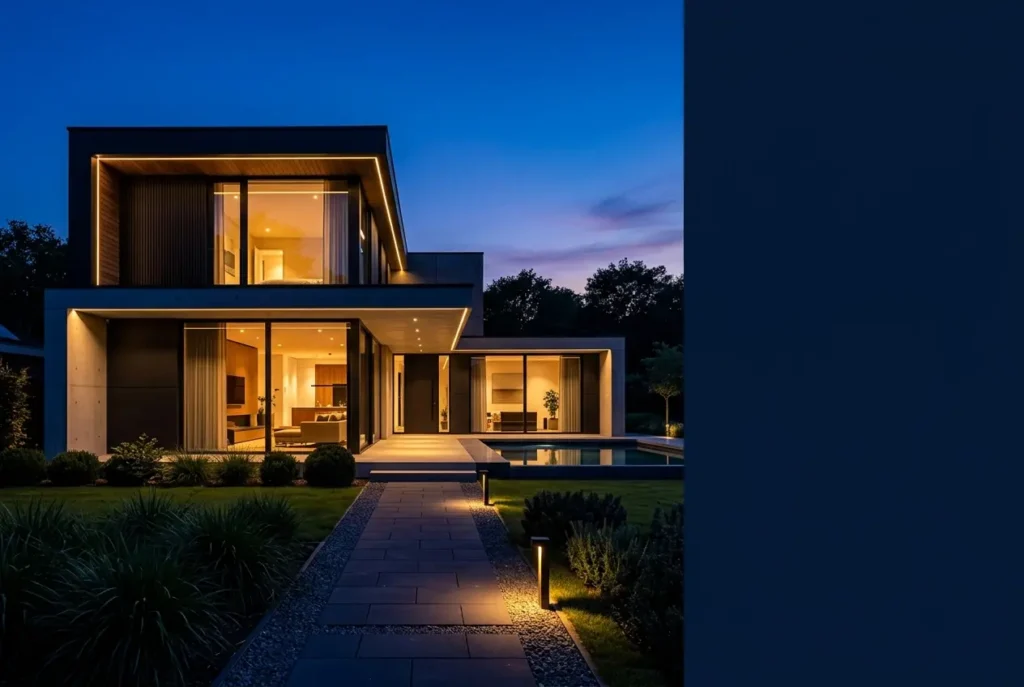
Every developer we work with has the same instinct: show the building in full sun, blue sky, crisp shadows. It feels honest and safe. But when a residential scheme goes to market, the image that stops a scroll or makes someone linger on a brochure spread is very often the one shot at dusk. Night and Dusk Exterior Renders: When Twilight Visuals Outsell Daylight Shots for Residential Developments is a pattern we see repeatedly in our studio, and it comes down to emotion, not decoration.
A home is not a sculpture. Buyers are not judging massing; they are imagining arriving after work, lights on, someone already inside. Daylight shows a building. Twilight shows a life. That difference is what we want to unpack here, including the technical decisions that make a dusk render believable rather than a dark, muddy mess.
If you commission these images, you should know why they work, when they don’t, and what to ask for. Let’s get into it.
Why Twilight Sells Homes Better Than Midday Sun
Midday light is flat and overhead. It flattens facades, shortens shadows, and makes materials look evenly lit, which is accurate and also a little dull. Dusk gives us a much richer set of tools.
First, there’s the contrast between warm interior light and cool exterior ambient light. Glowing windows read as occupied, welcoming, safe. Even on a development with no one living there yet, that warmth tells the viewer the building is a home rather than a plan.
Second, the sky does heavy lifting. A gradient from deep blue to amber at the horizon adds drama without any extra geometry. It also hides a multitude of real-world sins: a neighboring building that isn’t flattering, a bare site, a construction crane that will vanish by completion.
Third, dusk lets us control the story. We choose what is lit. Landscaping lights, path lighting, a pool glowing aqua, a lit entrance canopy. These guide the eye exactly where the marketing team wants it.
Dusk vs. Night vs. Daylight: Choosing the Right Mood
Clients often say “night render” when they mean dusk. They are not the same, and the distinction affects both the look and the budget.
| Time of day | Sky and ambient light | Best used for | Main risk |
|---|---|---|---|
| Daylight | Bright, neutral, strong shadows | Material accuracy, context, site planning | Can feel generic or flat |
| Golden hour | Warm, low-angle sun, long shadows | Facade texture, family-oriented marketing | Overly orange if not balanced |
| Dusk / blue hour | Deep blue sky, residual glow, lights on | Hero marketing images, brochures, hoardings | Needs careful light balancing |
| Full night | Dark sky, artificial light only | Amenity areas, commercial-leaning or luxury moods | Can hide architecture, feel heavy |
For most residential projects, true dusk is the sweet spot. There’s enough ambient light left that the form of the building still reads, while the interior and exterior lighting create the glow. Full night works for a clubhouse, rooftop terrace, or a pool deck, but a whole villa lost in black rarely sells well.
The Technical Side: What Makes a Dusk Render Work
Light balance is everything
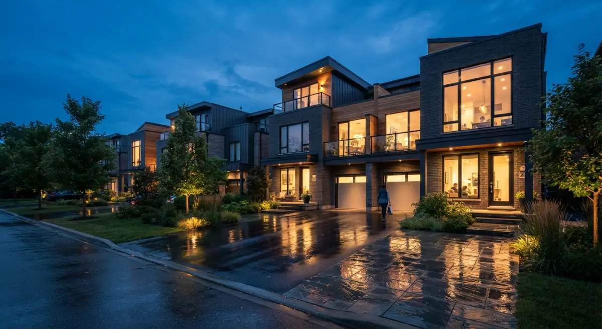
The most common failure in dusk work is a mismatch between sky brightness and interior brightness. If the sky is too bright, the windows look dim and pasted on. If the sky is too dark, the facade disappears. We build the sky first, then set interior lights relative to it, then test several exposure variations before committing to a final.
Interior lighting needs a real plan
Windows are not glowing rectangles. Behind every one of them we need believable rooms: furniture silhouettes, ceiling lights, a lamp in the corner, color temperature that varies room to room. A kitchen might be cooler and brighter, a bedroom warmer and dimmer. When every window glows the same flat orange, the image reads as fake instantly. This is one reason our 3D exterior rendering workflow includes basic interior setups behind visible glazing, even when no interior view is requested.
Materials behave differently in low light
Glass becomes reflective in a new way at dusk. With dark outside and bright inside, glazing shows both the interior and reflections of the sky. Wet paving catches light streaks beautifully. Stone and timber pick up warm pools of light from fixtures, and render engines need physically correct materials to handle this convincingly. Poor roughness and reflection values that survive in daylight fall apart at twilight.
Light sources should make sense
Every light in the image should have a believable origin: wall washers, bollards, soffit downlights, street lamps, landscape spikes. We avoid inventing glows with no source. Architects notice this immediately, and so do buyers, even if they can’t say why the image feels off.
Post-production finishes the mood
Subtle bloom around bright fixtures, a little atmospheric haze near the horizon, gentle color grading to separate warm and cool areas. The key word is subtle. Overcooked glow and heavy vignettes date an image fast.
What Clients Get Wrong About Twilight Renders
After years of delivering these, certain misunderstandings come up again and again.
- “Just change the sky and turn the lights on.” It sounds like a quick conversion from a daylight scene. In reality the lighting, materials, entourage, and camera exposure all need to be rebuilt or rebalanced. A daylight scene with a dark sky pasted in looks exactly like that.
- Too many lights. Lighting every possible fixture makes the building look like a shopping mall. Restraint reads as sophistication.
- Ignoring the landscape. Trees and planting turn into black blobs unless they’re lit deliberately. Uplighting a few key trees makes a huge difference.
- Using dusk for everything. A twilight image is a hero shot, not a replacement for every view. Buyers still want to see accurate daylight materials and context.
- Forgetting people and cars. A figure silhouetted in a doorway or a car with headlights on adds scale and narrative. Empty dusk scenes can feel eerie.
How to Use Twilight Visuals in a Residential Marketing Package
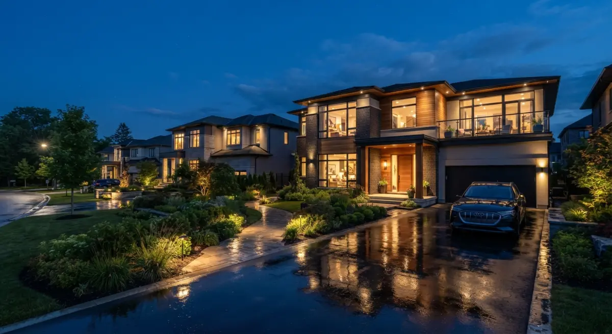
The smartest approach isn’t choosing between day and night. It’s using each where it does its best work. We usually suggest a daylight view to establish context and material truth, then a dusk hero image for the brochure cover, website banner, and hoarding. Amenity spaces like clubhouses and pools often get their own twilight treatment because that’s when they are used and enjoyed.
For multi-building developments, a dusk aerial can be striking, showing lit windows scattered across several towers or villa clusters. It conveys community and scale in a way a daytime aerial rarely does. If your project needs that, our 3D architectural rendering team can plan the full image set so lighting stays consistent across views.
Pre-sales is where this matters most. When the building doesn’t exist yet, the render is the product. A well-judged twilight image does the emotional work that a model apartment would normally do, and it does it before a single brick is laid.
A quick brief checklist
To get the best result, give your rendering studio:
- The intended orientation, so we can place the sky glow on the correct side of the building.
- Lighting design intent or fixture schedule, if the landscape and facade lighting has been specified.
- Interior mood preferences: warm and cozy, or crisp and contemporary.
- Where the image will be used: print, digital, large-format hoarding. This affects resolution and how much dark detail needs to hold.
- Any site context that should be softened or hidden.
Is a Twilight Render Honest?
Fair question, and developers sometimes worry about it. A dusk image should still represent the real design: the same materials, proportions, and lighting scheme. We’re choosing the most flattering moment of a real day, which is exactly what architectural photographers do when they wait for blue hour. Nothing misleading about it, as long as the lighting shown is something the building can actually deliver.
Final Thoughts
Twilight images work because they sell a feeling before they sell a floor plan. Done properly, with balanced light, believable interiors, and restrained styling, they become the image people remember and the one that ends up on the cover. The craft is in the details nobody consciously notices: the color of a bedroom window, the reflection on a wet driveway, the exact moment in the sky’s gradient.
If you’re planning a residential launch and want hero imagery that carries real emotional weight, talk to our team about dusk and night exterior renders tailored to your project. Send us your drawings and we’ll suggest the right mix of daylight and twilight views for your buyers.
Frequently Asked Questions
Why do twilight exterior renders sell residential developments better than daylight shots?
Twilight renders create an emotional, lifestyle-driven impression by showing warm interior lighting against a deep blue sky, which makes homes feel inviting and lived-in. The contrast between glowing windows and the cool dusk sky also highlights architectural features and gives images a premium, editorial quality. Because buyers often picture coming home after work, dusk scenes align with when they would actually experience the property.
What is the best time of day to set up a dusk exterior render?
The ideal window is the so-called blue hour, when the sun sits roughly 4 to 8 degrees below the horizon, giving a rich gradient sky that is still bright enough to show building form. In 3D software, this typically means a sun angle just below the horizon with a high-quality HDRI or sky system. Balancing this ambient light with interior glow, around a 1:1 to 1:2 exposure ratio, keeps windows warm without blowing out the facade.
How do you light a night exterior render so it looks realistic and not too dark?
Use a layered lighting approach: warm interior lights (about 2700-3000K), landscape and path lighting, accent uplights on facades, and a subtle cool sky fill to preserve silhouette detail. Avoid pure black shadows by adding low-intensity ambient or moon light and by using IES profiles for realistic light falloff. Finish in post-production with gentle glow, bloom, and color grading to tie the warm and cool tones together.
Do twilight renders cost more than daytime renders, and are they worth the extra investment?
Twilight renders usually cost 10 to 30 percent more because they involve more light sources, longer render times, and additional post-production work. However, they often generate higher engagement on listings, social media, and brochures, which can speed up pre-sales and justify the added cost. Many developers commission both, using daylight for context and detail and twilight as the hero marketing image.
When should a developer choose daylight renders over twilight visuals?
Daylight renders work better when you need to show true material colors, landscaping, site context, or shared amenities like pools and playgrounds in clear detail. They are also preferable for planning submissions and projects where accuracy matters more than mood. A balanced marketing package typically combines daylight images for information with twilight images for emotional impact.


1 comment